Holly Morrison approached me early in 2020 to create a consistent brand for her family-run Café, situated in my home town of Wells, Maine. Here is the RANGE OF CONCEPTS that were presented. Holly asked me to take the logo with the raspberries and blueberries and expand with more fruit. I love the final outcome with the interplay of the type and fruit!
Author: AdMarkCom
Maine Coast Potato Chips
This logo was designed for an innovative entrepreneur who went up against Cape Code Potato Chips. The company was successful (see bag design). This start-up company was later purchased by a multi-national food company.
Jeff W. Daigle, DDS
Jeff had a vision for his branding … he wanted to use a loon in his logo. This vector-based image was designed to allow only two colors of ink in printing office materials. I believe this was created in the early 90s and I feel it remains contemporary today.
Kiwa Japan

This logo was produced for the US affiliate of a Japanese coating-to-metal company.
Ad•Mark•Com/Advertising & Marketing Communications
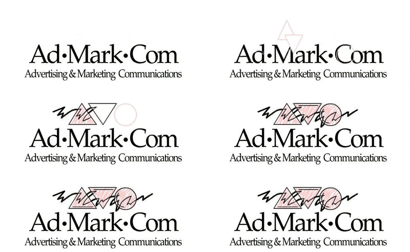
Fun graphic shapes from name initials. This graphic is a flash animation.
